Jack Fink’s
Three- dimensional Design Students 2010
Nassau Community College
Any design, be it in the visual arts, the dance, music, the theater, the artist seeks to create some kind of order so the work of art can be understood. The unity of all the parts and their relationships to the main theme, organized into a cohesive whole is the goal. Think of it like a play in the theater : you have the main character(s) and the supporting cast, the latter, each at the service of the main character or characters, all at the service of the “story.”
Consider each of the following student construction images as models for larger sculptures or installations. Becaause of modern technology, these may be turned over to fabricators like the Johnson/atelier company in New Jersey to be transformed into metal designs of any size. See their site at http://atelier.org/latest.htm and surf through it for their capabilities serving artist/designers.
Essentially this is what these first student projects are about: manipulating the elements of design (form, color, pattern, line, etc. guided by compositional principles) to create a design that has visual impact; a design that will attract the viewer’s eye and hold his attention , powerd and driven by the relationship of all the parts.
Stephanie Sarro
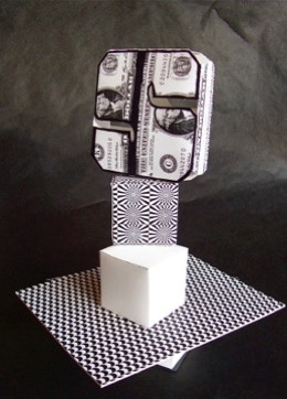
Stephanie chose the photo-copied dollar bill as pattern-imagery for the main focal area of this composition. Size and contrast (to the other design elements ) tends to control what she wants you to see first. Folding a Bristol paper rectancle she opened up the interior of the form by cutting appropriate shapes in the surface.
Elliot Nation shows his imagionation in incorporating photo imagery and newspaper type into the design to the left. There is a visual drama produced in his fan-shaped construction above, where a burst of light and shadow radiates from the center of this design. No confusion as to where the focal point is here.
Appoximately 8-10”H, Bristol paper, matt board, photo
As viewers, when we look at something visually interesting, our nature is to try and make sense of it, to seek out some order within it that will reveal it’s meaning. In this sorting-out process, the power of an art composition may be visually effective on three levels :
• for the eye
• for the mind
• for the spirit.
Some works of visual art are abstract, have no representational images from nature and may be designed for the eye only. Because of the context of the design, (perhaps for a wall decoration in the lobby of some corporate headquarters, or a walkway between airlines in an airport), the design may need only to exercise the eye. People are in a hurry, little time to stop and invest their attention for some deeper meaning.
Tyler Caiati
Tyler is unique in responding to creating a design that is a well-balanced composition in assignment #2 . . . She was the only one out of 21 people to use cone shapes and to good effect. Her composition is straight- forward, uncluttered and to the point.
Good advice when designing:
LESS IS MORE!
( Don’t make your design too busy.)
Robert Lemos
Robert Lemos exercised one of the principles of good creative thinking when he was assembling materials : be aware, keep your “antenae” tuned-in for possible ideas and materials for your next artwork. Sent to the attic by his mother to clean and straighten the clutter, Robert came across a packet of “scratch-off” paper. The paper has a black coating, that when scratched-off reveals the multi-colored metalic surface below. Recognizing it’s value, through his chance encounter he applied it to this construction design.
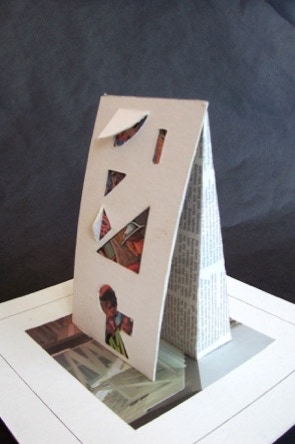
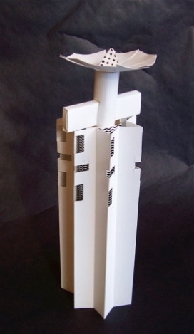
Arien Dijkstra
Here is an example where the simplicity of this vertical design (three forms stacked) may be what an architect is looking for i.e. to be the center-piece of converging walk-way. Sculptor/designers often colaborate with architects.
New York’s Percent for Art Program is one of the largest municipally funded public art programs in America. Over the past two decades, it has commissioned and installed over 200 site-specific, permanent public art works throughout the City’s five boroughs. http://www.aiany.org/centerforarchitecture/cityart/
For every public building in NYC that is built, !% of the total cost must be spent on art.
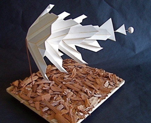
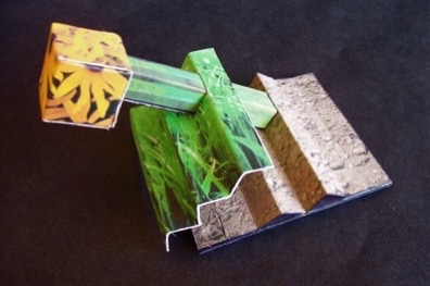
Elliot Nation
I’m sure this project was influenced by a previous exercise requiring students to create a form that used texture as a surface. In this case, there was a bucket of chips left by one of the other instructors, so Elliot saw possibilities here and helped himself. The complicated sequence of accordion folded shapes, one within the other, is an expressive statement about motion and transformation.
Bristol paper, welding rod, wood chips, plywood. 12” x 12’ x 6”
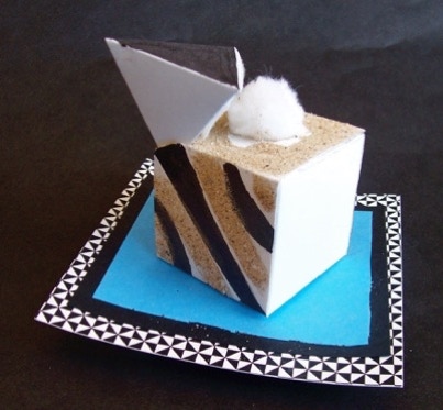
Robert Lemos
Create a form using texture as an expressive element of design.
The balance and unity of this piece is cinched in the “echo” of the color black, first in the three broad stokes on the side of the cube, on the triangular plane of the pyramid above it, then imaginatively restated on the pedestal.
Principles of Composition #1 - Avoid a sore thumb.
Nothing in the composition should be so strong that the rest of the composition looks neglected. When you have a sore thumb, you don't notice the rest of your hand. Avoid the SORE THUMB. I study my composition to see if anything looks too important, I change that part to make it less important, OR I find something else in the composition and make it more important.
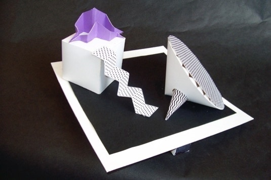
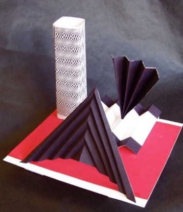
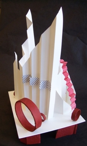
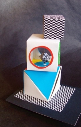
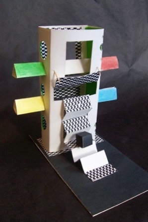
Nadia Harding
Without the elevated pedestal, this construction may be considered as an installation to walk through, should the design be an enlarged into a monumental metal construction.
The assignment
was to use some of the same geometric forms used in the previous assignments, but incorporate the accordian-fold as a new, significant design element. The space that the sculptures are to be seen is defined by the placement of the major forms in the boundries of an elevated pedestal.
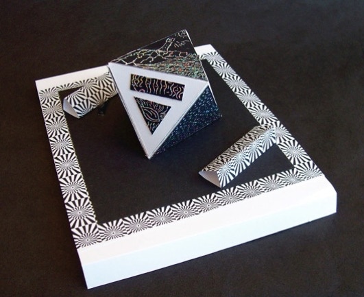
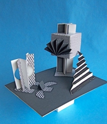
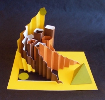
Kiesha McFadden
Kiesha’s stunning combination of just three colors is a marvelous example of “less is more” approach to design. Reinforcing this concept is her understanding of the importance of establishing a “theme,” epressed in her using the accordion fold in a variety of ways; she establishes the main focus through the larger triangular wedge that appears ready to take flight in its diagonal positioning. Regarding taking flight:
http://en.wikipedia.org/wiki/File:B-2_first_flight_071201-F-9999J-034.jpg
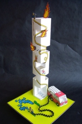
Cesar Cristancho
Cesar’s ready smile is expressed in the novelty of his “burning tower.” He exercises so many elements of design in this charming piece, where the accordian styled fire hose is trasformed into line as it snakes up the tower. All of it folded from Bristol paper, and punctuated with colored marker.
Principle #2 - Keep everything connected.
Every aspect of the composition should be connected to something else in the composition. Think of this as Theme With Variation. If I use a big red circle, perhaps I need another circle or another red or another big thing. I probably should not have another big red circle. If I use a black and white cow, I may need another animal or organic shape, or I may need another instance of black and white spots, etc., and so on.
Robert Lemos
Tyler Caiati
Arien Dijkstra
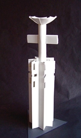
Two variations on a theme.
Because of tight storage space, Arien placed two separate exercises on the storage shelf, slipping the “cross” image inside the taller tower-like form on the left. In our conference I suggested he consider leaving the happenstance combination as a possibile design. His final dicision is on the right. Perhaps it is the final dicission, or perhaps not. Sometimes an artist has to live with a piece for awhile.
Design Principle #5 - Cherish Mistakes or Chance Happenings.
Mistakes are fascinating gifts, and what we do with them makes all the difference. It is difficult enough to plan creative work, but when a mistake happens, I am given a gift. When I respond to the mistake and make a new thing from it, I do not have to borrow other artist's ideas to be creative. It has emerged as my solution. On the other hand, when the mistake is an obvious failure, it means that I have to get to work, do research, experiment, or simply PRACTICE MORE. These are all positive outcomes.
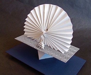
Nadia Harding
Nadiahas a natural sense of design, handling color, form and pattern very well in the above compostion. The pattern is played against plain surfaces, light against dark, and a splash of color to lead the viewer to the main area of visual importance. It is a secret of sorts.
The viewer is invited to a visual surprise when the central form is opened revealing yet another space, where a smaller form is suspended “on-point” by a thread.
Approximately 8 inches high of Bristol paper, colored construction paper, matt board pedestal.
Principle #3 - Include Secrets.
Artwork is more interesting and expressive if it has hidden features and ideas that it only reveals to diligent observers. The popular arts, by contrast with fine art, make everything obvious at first glance.
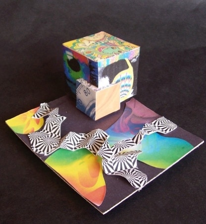
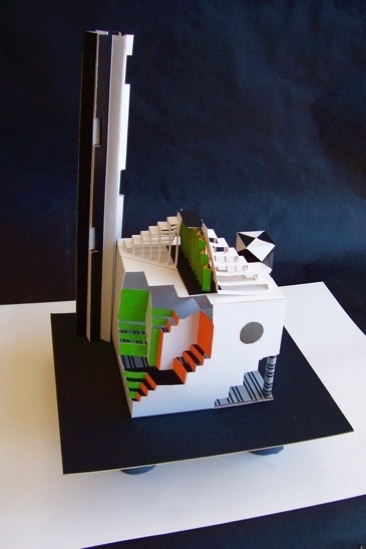
Anthony DiCarlo
Anthony intuitively understands the importance of pattern and color in these two compositions, the visual impact they create. There is nothing bland in either of these two designs. The human brain seeks order, rejects what it can not organize, what it can not understand. The visual task of the designer/artist requires that we present a structure for color to work. Color harmony delivers visual interest and a sense of order.
Art can be therapeutic. Once you turn yourself over to the process, you can get “lost” in time and place in the act of creating it. Sometimes your spirit is lifted up in the midst of the creative act. But, conversely, sometimes it is like “sweating bullets” to arrive at what you wanted the piece to “say.” When it all comes together, there is nothing better.
Nadia Harding
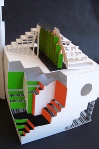
This is Nadia’s second construction, far busier than the one above, Where she opens up the interior space, as well as penetrating all with two colorful triangular beams.
Bristol paper, matt board, colored paper, markers. Approx. 10” high.
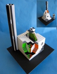
Cesar Cristancho
A marvelous show of craftsmanship and design. There is good reason to celebrate the passion and considerable time investment that Cesar has put into this piece, indeed, his enthusiasm for all his art.
Sarah Tahang
Beautiful use of color and folding. An undderstanding of how the need for “variety” in a compostion is a means of attracting and holding one’s attention. Well done!
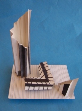
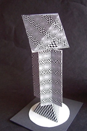
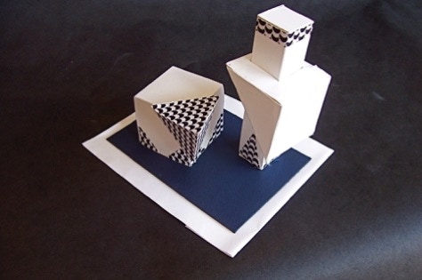
Brian Smith
The “right-angle” form is a nice contrast in shape and pattern to the similarity of the other two shapes. The lined surface of the pedestal adds visual interest and is subtle enough to be in keeping with the rest of the design.
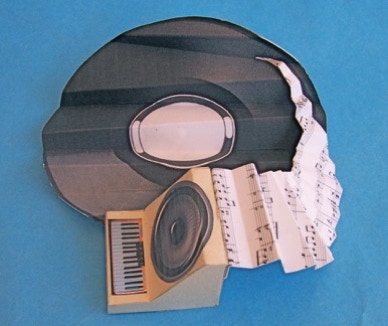
Anthony DiCarlo
The assignment was purely a technical one: use the accordion-fold technique as a major design element in your composition. Obviously Anthony brought much more to the assignment - his love of music.
A very inventive composition on several levels.
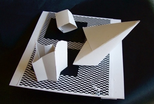
Rani Nimblette
Minimalism describes a style of art. In various forms of art and design, especially visual art and music, where the work is stripped down to its most fundamental features, only the essentials are found. Without consciously aware of such things, Rani has created a design with little oranmentation, no color per se, only blacks and whites; His three forms are simple and unadorned, but enhanced by the context in which they’re seen.